ASCII postcards
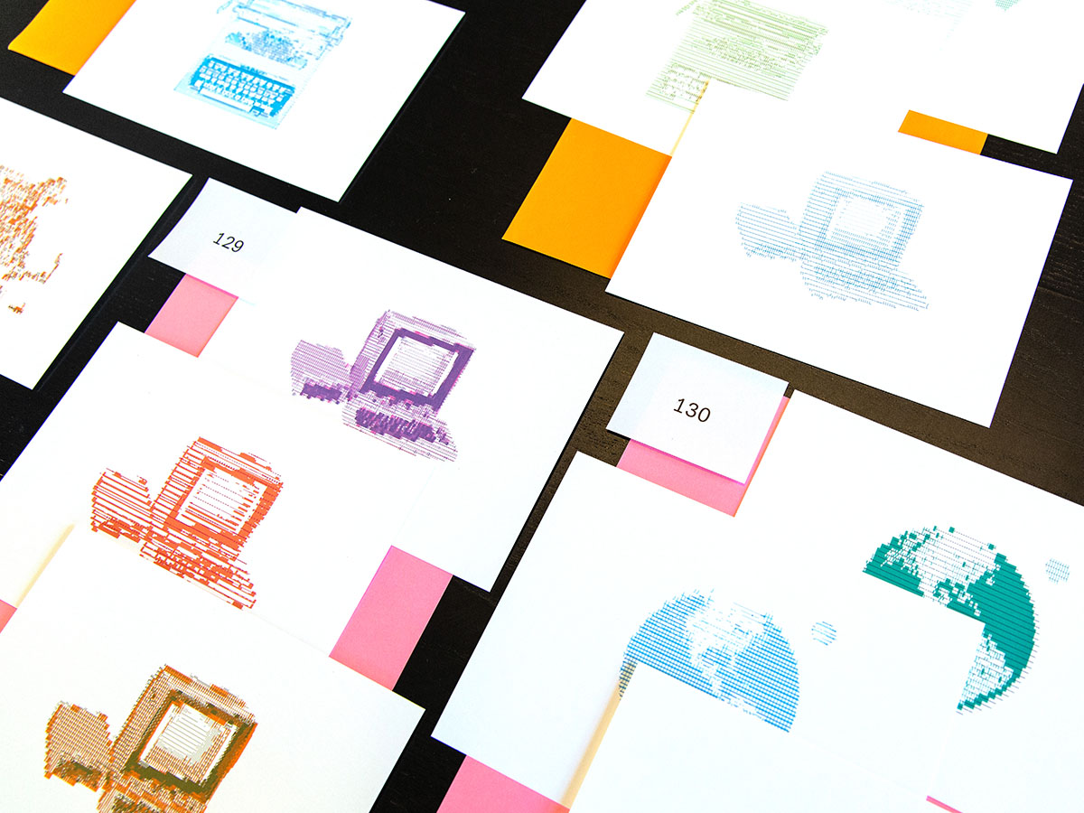
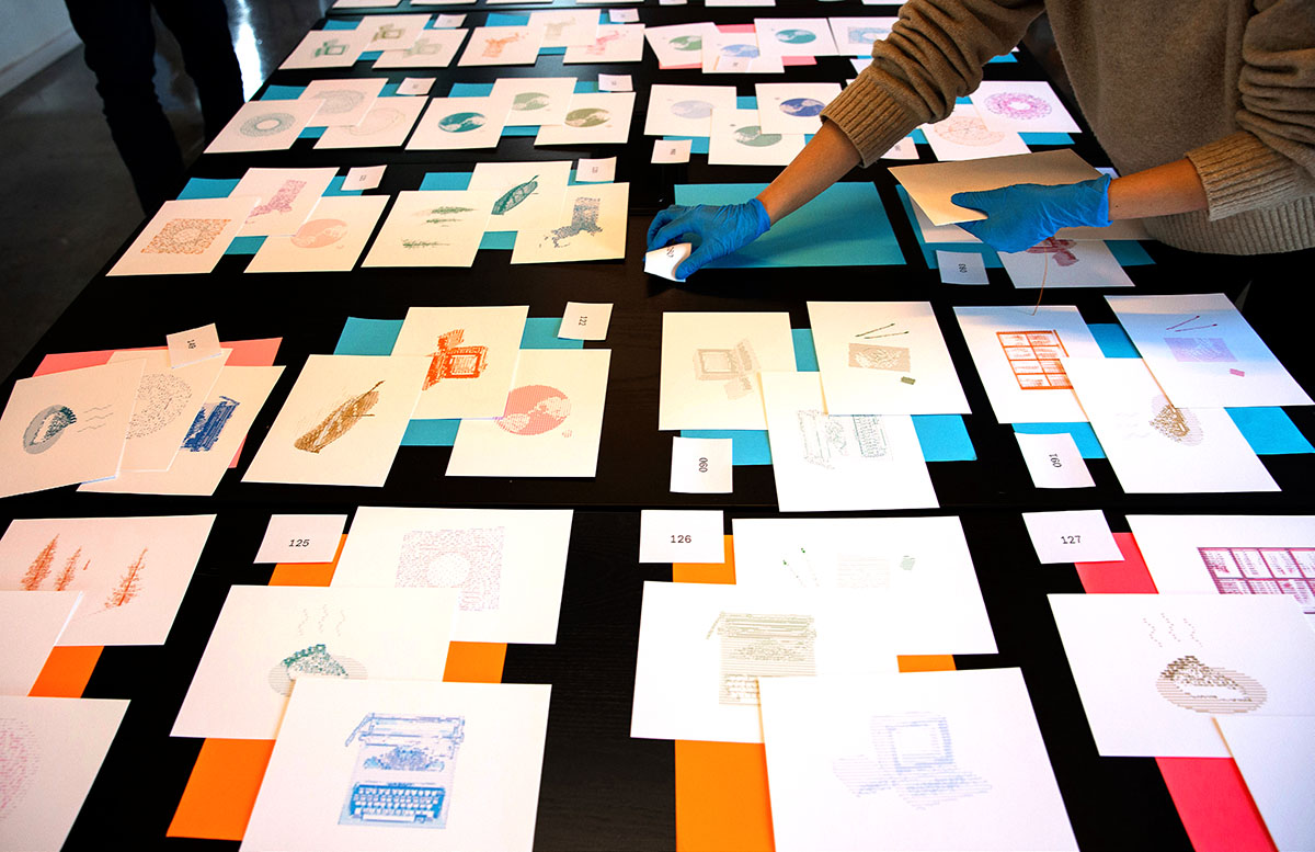
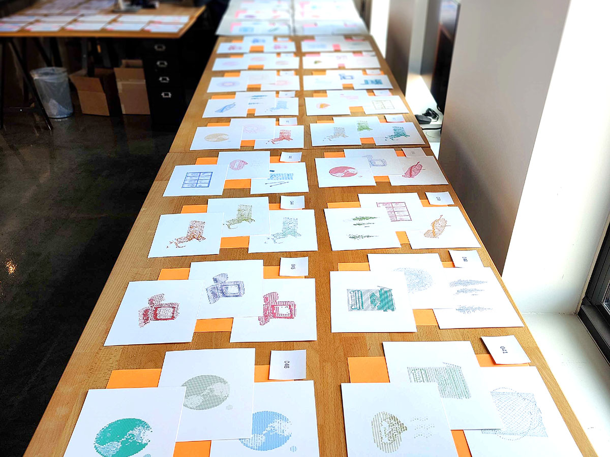
I designed this collection of ASCII art postcards as a Fathom holiday gift for friends, family and clients of the studio – about 150 recipients.
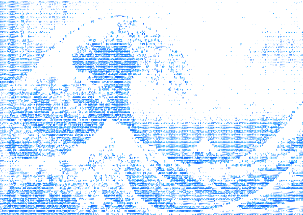
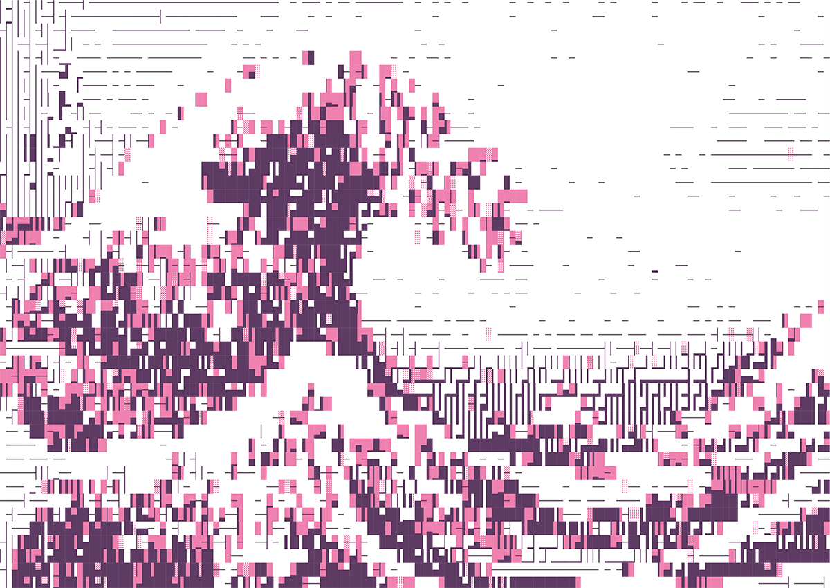
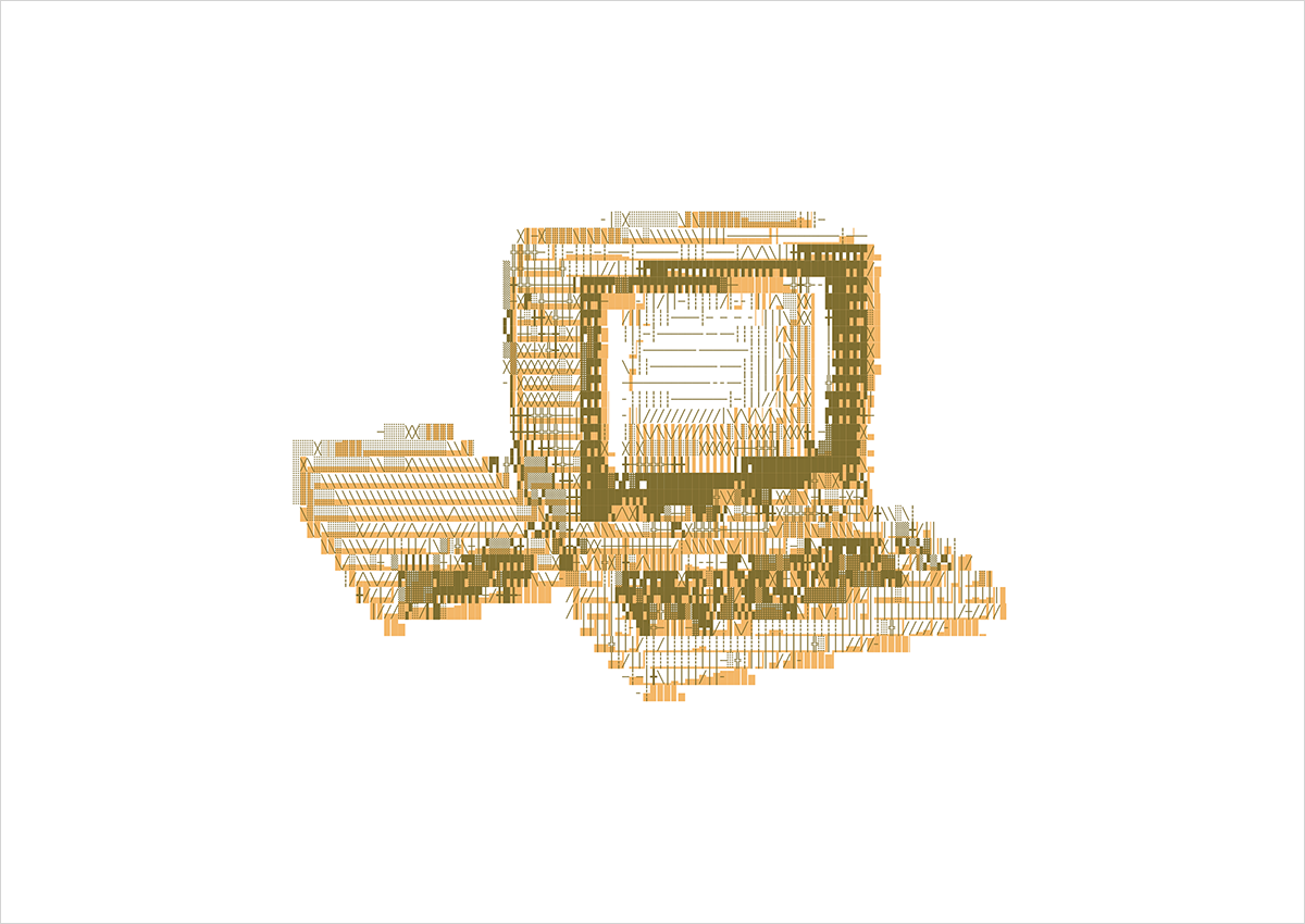
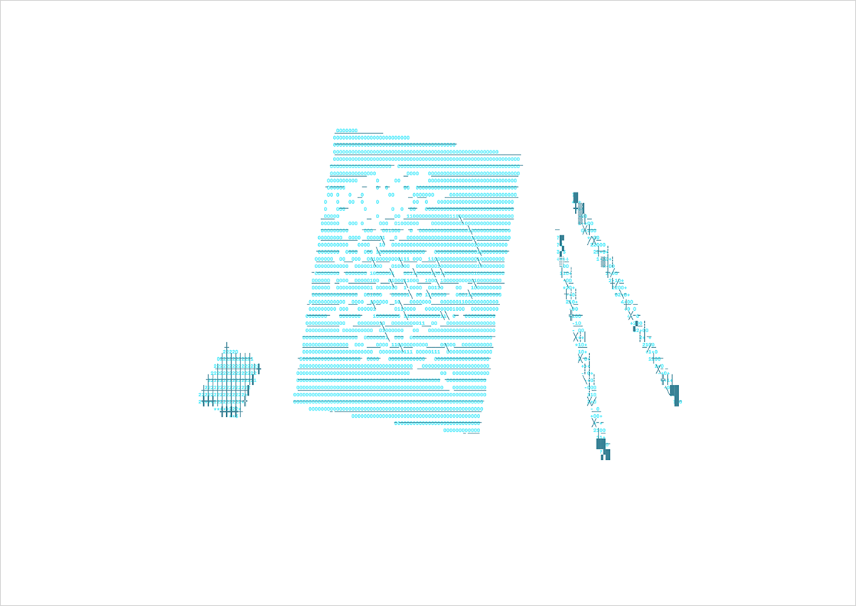
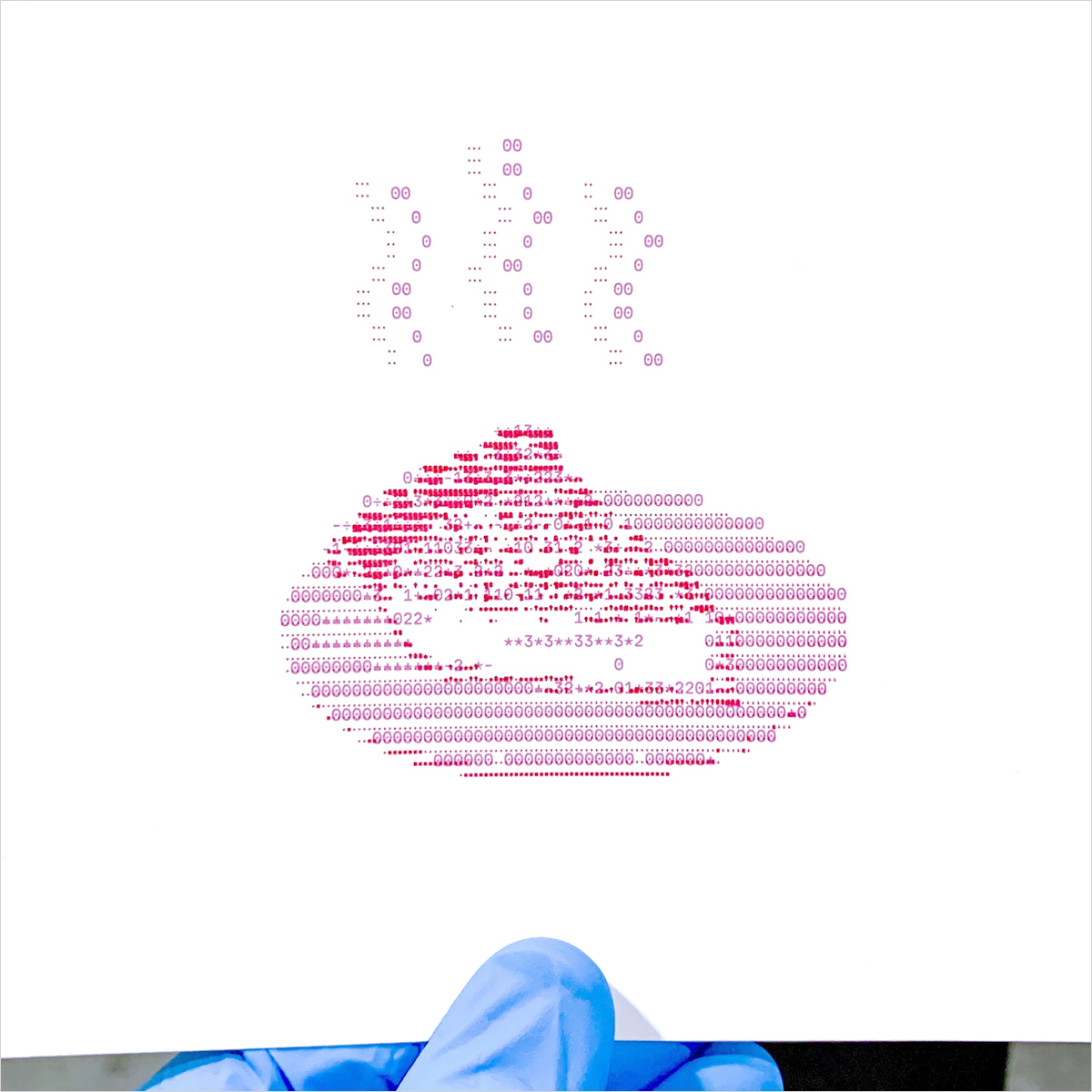
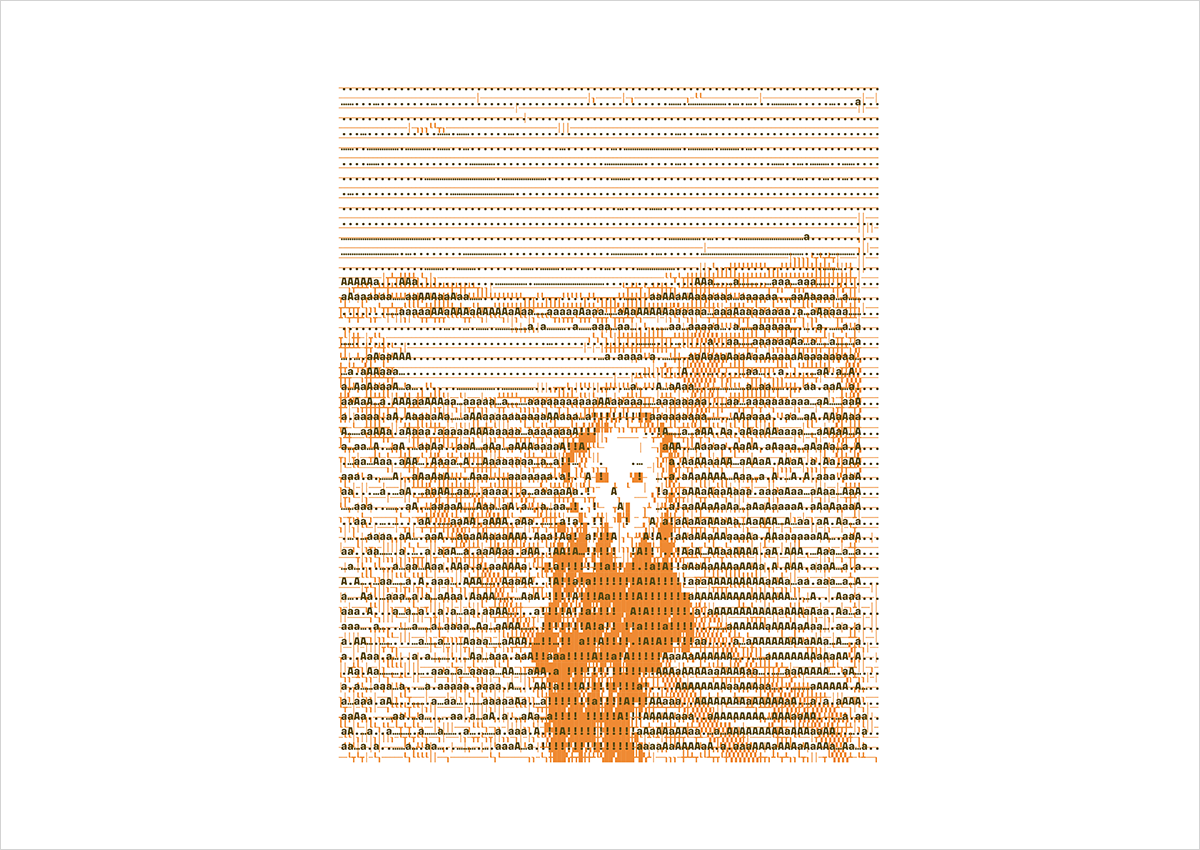
To produce them I built a chance-based printmaking system that composes each design from a unique combination of text characters.
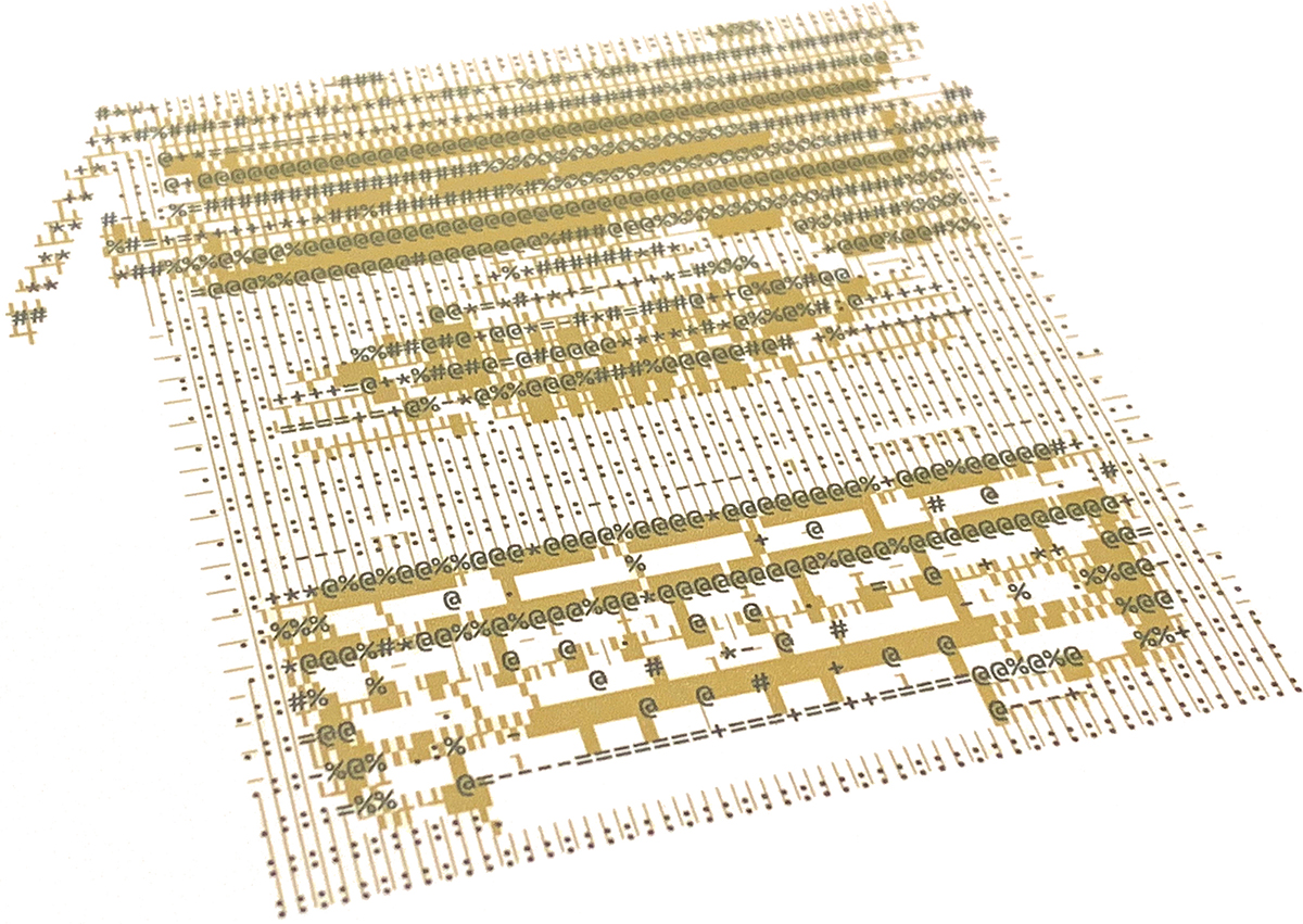
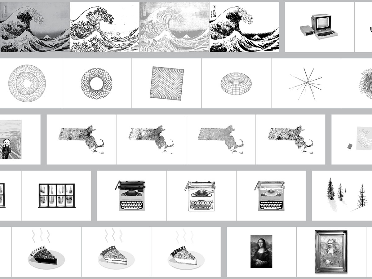
We mailed each recipient a thematic set of three of the postcards. In addition to variation of the illustration themes, there are a few generative axes that make each print unique: the typographic characters used to compose the image gradient, font weight, grid density and color palette.
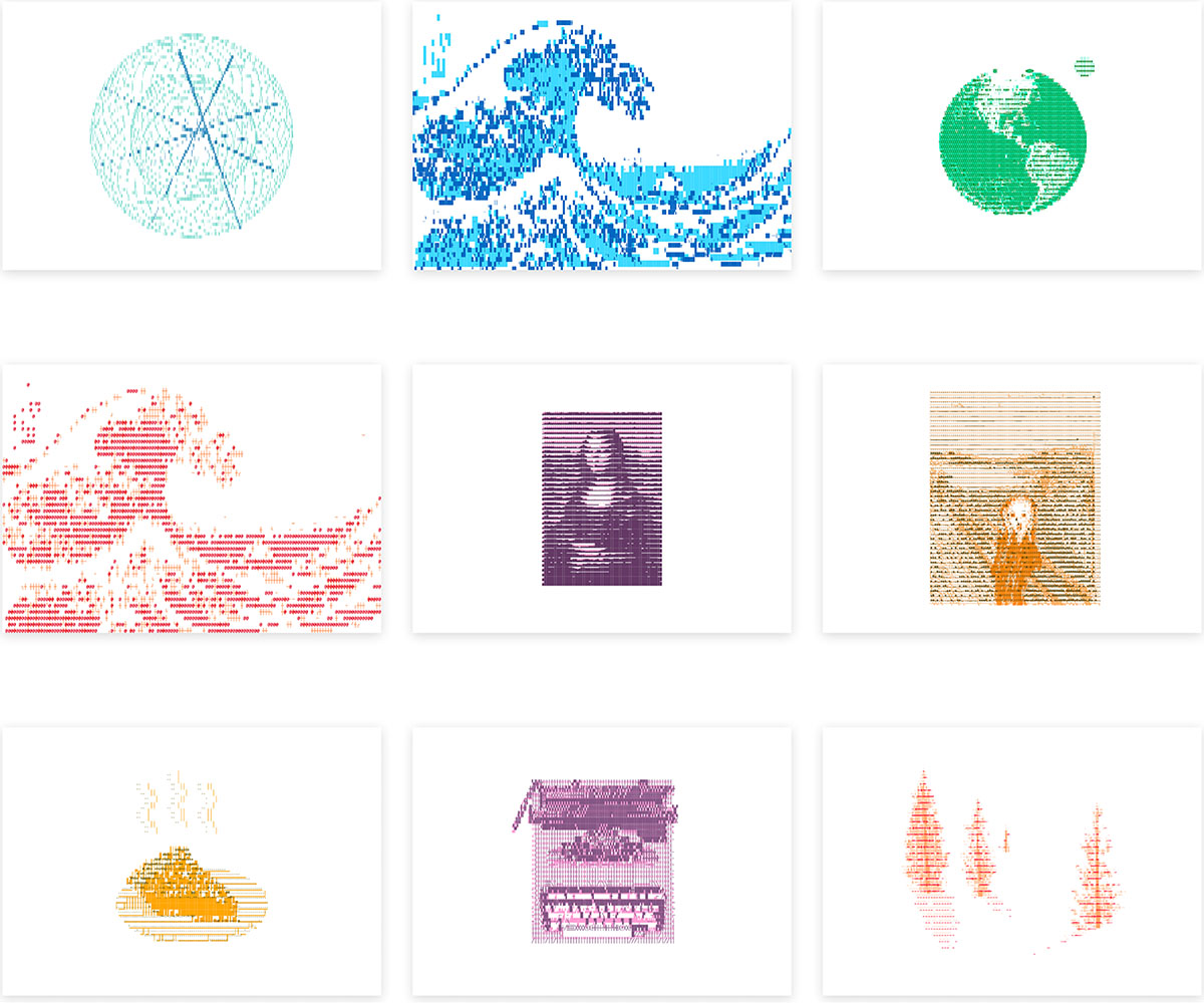
I thought it would be an interesting twist on the standard black-and-white ASCII style to try overlaying two passes of color, each layer interpretating the source image a bit differently.
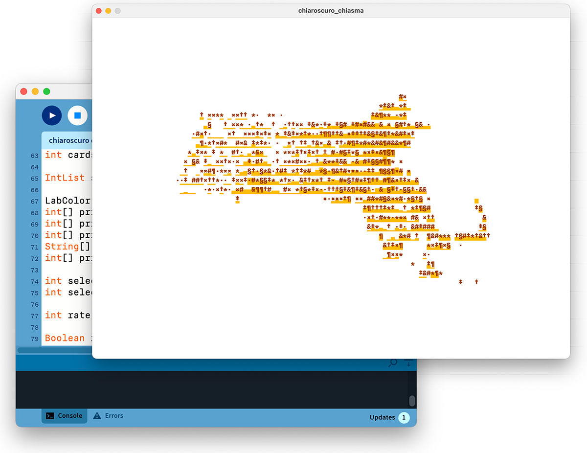
That’s the loose idea I had in my head. Next I started sketching with code in Processing to iterate on the concept.
The source images are a festive medley of New England scenery (to set a wintry tone), drawing and writing tools (for artistic inspiration) and a few masterpieces of the fine art canon (expired copyrights).
Experimenting with the parameters, it was clear that feeding in a couple variations of the source images created the most compelling designs – causing the two color layers to misalign in complementary ways.
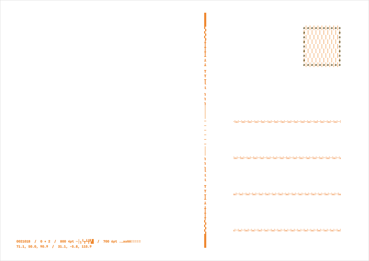
The reverse side remixes the ASCII characters used in the print into a standard postcard layout so you can jot a message to the typography-obsessed person in your life.
…and the generatively animated ASCII Art Yule Log lives online at fathom.info/yule.
Font in use: MD IO